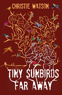
Which cover would you choose?
Happy New Year, everyone. The last year was a challenging but satisfying one for us at Cassava Republic Press. We want to thank you for your generous support.
Looking ahead, we’ll be publishing some exciting new titles this year. One such book is Tiny Sunbirds Far Away, by Christie Watson. It’s a coming of age novel set in Lagos and the Niger Delta, and we think it’s just fabulous and it’s going to be a hit. As the book is still in production, we thought you’d like to get a peep at the process on how we decide on what will become the cover jacket.
The first thing we do is prepare a design brief for our supremely talented designer, Lynn Hatzius, which includes a synopsis of the plot and a description of the places of the novel. We also described some of the characters as well as some of the turning points in the story.
Here is what she sent back:
Version 1:
Version 2:
Version 3:
We think all three of them are wonderful, but we would love to know which one you prefer.
Please post your comments below.
Looking forward to a great 2011!


24 comments:
Happy New year to you to Jeremy,
I prefer the second design.. something about it is catchy
Second design. The third design's not even an option.
V1 for me.
#1's fantastic!
The second book cover definitely...
i prefer version 3. happy new year to you. Are you open to random people like myself sending you examles of our work. i just want to know if i can cut it in this writing thing
I like the second design.
The face initially caught my attention before I then noticed the little birdies.
I then became intrigued as I now want to find out the connection between the girl and the birdies.......
Happy New Year! I vote for version three
The first design's nice and most alluring. The third would have been if there wasn't so much going on in it.
I think the second one. There is something striking about the simple image, esp in comparison to the other two. But I wish the girl was in colour. The black and white may stop it from standing our on a shelf.
I like the last two covers. I think the second one would be best if the book is aimed primarily at a female audience and the third one if it isn't.
Version 3.
Happy New Year!
I agree with Authorsoundbetterthanwriter. Option Two, with some tweaks.
The first two are really good. The third one does not appeal to me. I will go with the second one. It has a more classic look about it.
I vote for the 2nd version.....
#1 0r #2
But if pressed, i'd say #1
I say the third one especially with the way the title and birds stick out more to me here.
The question is if you do not have the luxury of getting closer to examine the book in a book stand, which one will attract you right away in competition with so many other books?
Version 3 because you will not miss it in any book stand whether near or from afar. If you want to sell the book which I believe is the intention then go with Version 3.
The other two have that effect of making you look beyond them especially if you do not have the time. In situations like that, the tendency is to go for the title you can read clearly.
Version 1 and 2 will do well as framed art for your living room or reception space.
the oxblood red version mos def
I like Version 1
Version 2 ...☺
2.
You at least want people to be able to read the frakin' title, no?
Love #1
Nr. 3. But they are all good. Marin
Post a Comment